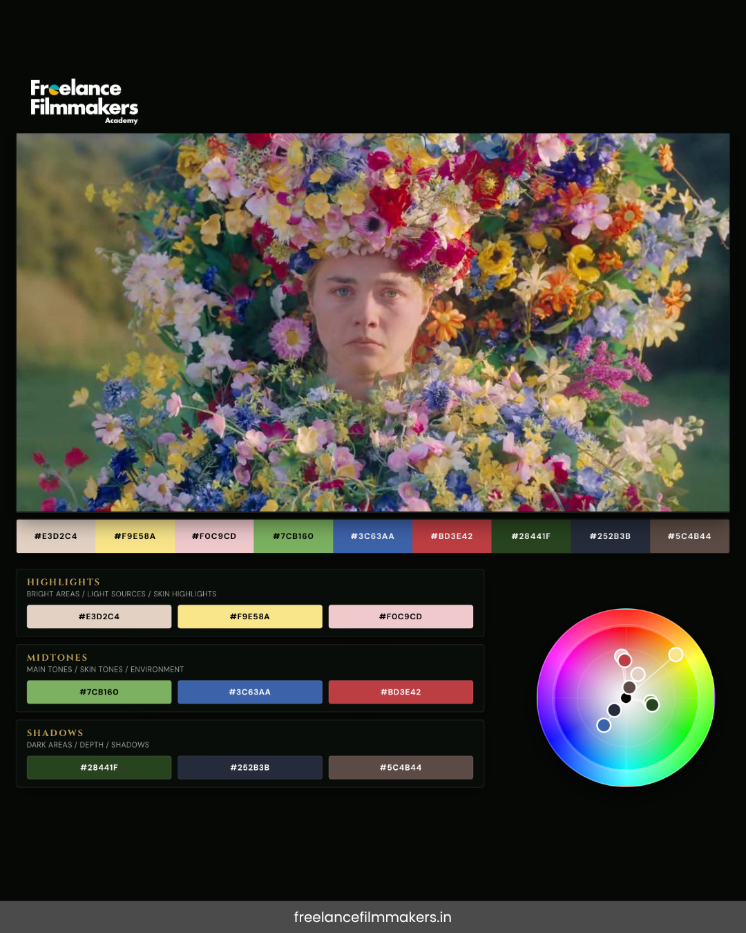
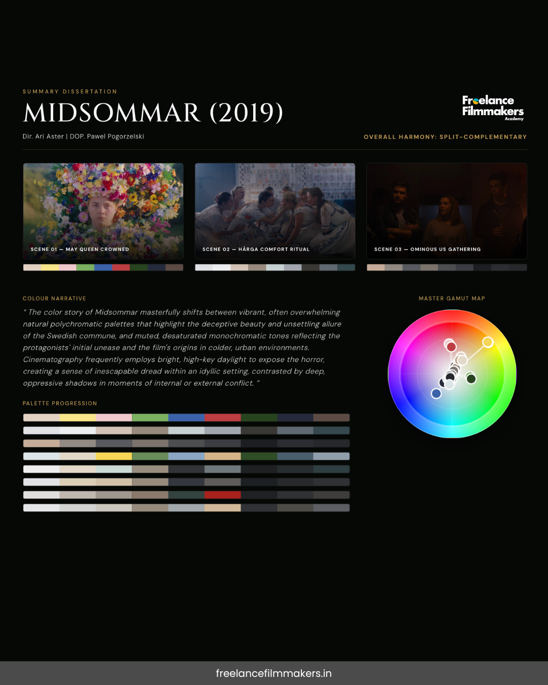
Emotion and the Science of Color Behind Midsommar (2019)
Explore how Ari Aster uses color science and psychology in Midsommar (2019) to create visceral emotional responses in audiences. A deep dive into horror filmmaking's visual language.

So you've probably seen Midsommar by now, right? And if you have, you know that weird feeling it gives you like something's deeply wrong, but you can't quite explain why. It's bright. It's beautiful. It's terrifying. And honestly? A huge chunk of that mind-bending experience comes down to one thing: color.
Yeah, seriously. It's not just the slow-burn storyline or the cult vibes that mess with your head. Director Ari Aster and cinematographer Pawel Pogorzelski engineered an entire visual experience using color science that basically hacks directly into your nervous system. Let me break down how.
Why Color Matters (More Than You Think)
Here's the thing about color it's not just aesthetic. Your brain processes color before it processes anything else. We're talking milliseconds. Before you even consciously register what you're seeing, your subconscious is already reacting emotionally to the colors in front of you.
Colors have psychological associations that are almost hardwired into us:
Red = danger
Green = safety
Blue = calm
We didn't invent these connections; they're evolutionary. Our ancestors' brains learned these lessons the hard way, and we inherited that emotional baggage.
Midsommar weaponises this. It takes everything we instinctively know color should mean and twists it into something deeply uncomfortable.
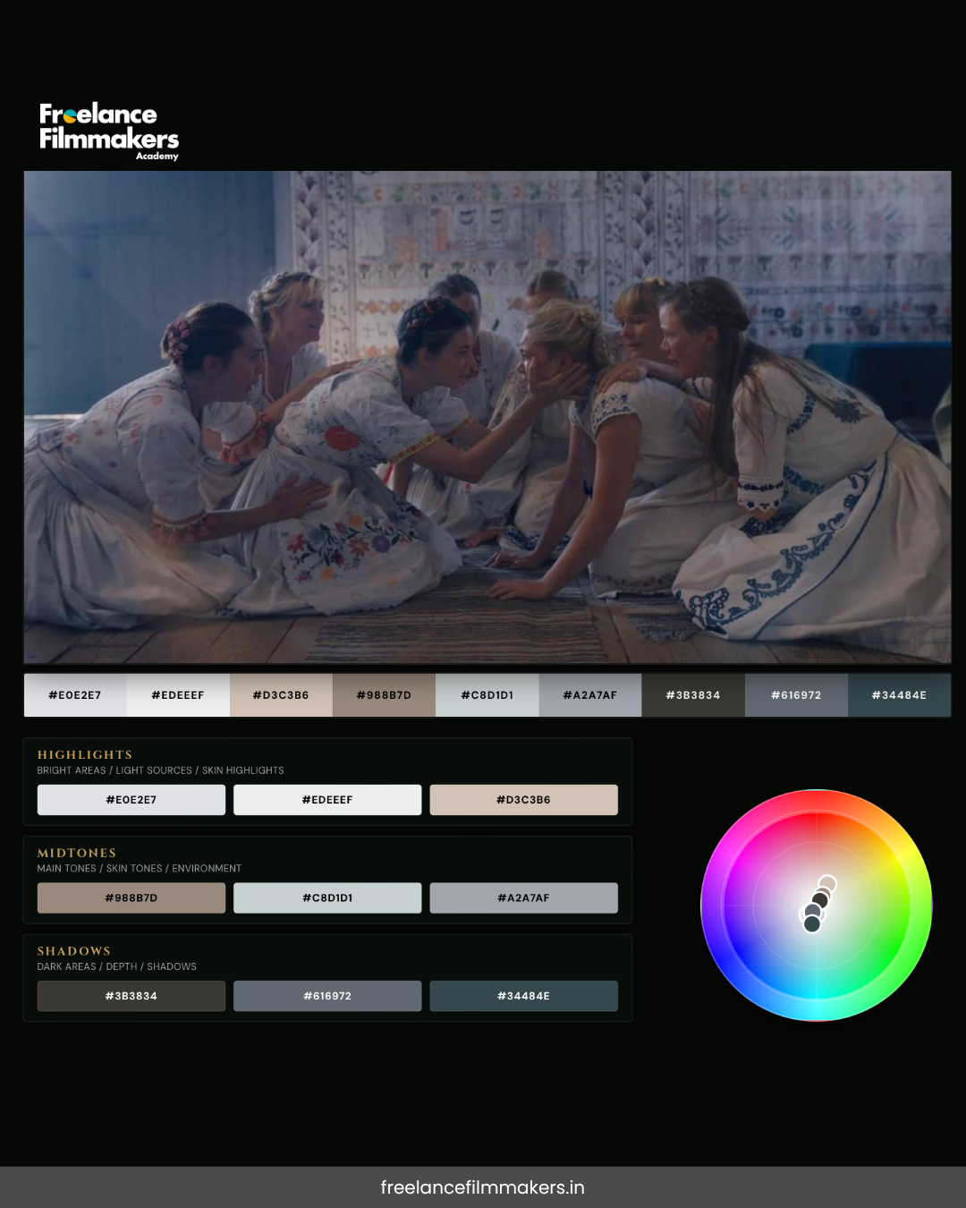
The Floral Palette: Beauty as a Mask
Let's talk about what's literally staring at us from that opening card: flowers. Tons of them. Pinks, yellows, reds, whites. Gorgeous, right?
But here's where it gets twisted. Florals are supposed to signal beauty, growth, celebration. Think weddings. Think happiness. Aster knows this, and he uses it against us. Throughout the film, flowers aren't just scenery they're a visual language that says "this is beautiful, this is okay, relax."
Except it's not okay. It's a cult. It's violence. It's your girlfriend's friends dying in horrific ways.
That cognitive dissonance? That's intentional. Your brain's expecting one emotional response based on the colors you're seeing, but the narrative is feeding you something completely different. It's a form of visual gaslighting, honestly.
The Daylight Horror: Breaking Every Rule
Here's what blows my mind about Midsommar: it's a horror film shot entirely in bright daylight. Like, criminally bright daylight. No shadows to hide in. No darkness to soften the brutality. Everything is exposed, saturated, almost hyperreal.
Traditional horror uses darkness and low-key lighting for a reason: it creates mystery, unease, the unknown. But Aster said, "nah, we're doing the opposite." He floods the screen with light, which is supposed to make us feel safe. Instead, it makes the horror feel more immediate, more inescapable.
And the colors in this daylight? Highly saturated. This isn't muted, natural sunlight. It's almost oversaturated, that slightly unreal quality that makes everything feel slightly off, like a dream (or nightmare) you can't quite wake up from.
Yellow: Warmth Turns to Sickness
Yellow is everywhere in Midsommar. It's the golden hour sun. It's the flowers. It's the clothing. Normally, yellow = warmth, hap
piness, safety. It's the color of sunshine and optimism.
But in this context? Yellow starts to feel sickly. Feverish.
There's something about how Pogorzelski shot it slightly too bright, slightly too acidic—that makes you feel nauseated rather than comforted. It's still warm, but warm like a fever, not a hug.
This is genius-level color manipulation. The same color that would make you smile in a different context makes you deeply uncomfortable here. It trains your brain to feel suspicious of what should be comforting.
Red: Sexuality, Violence, and Sacrifice
Red in Midsommar is doing a lot of work. It's the color of flowers, beautiful and romantic. But it's also the color of blood. It's the color of danger. It's the color of Dani's dress at the festival's climax.
Here's the psychological thing about red: it's a color of high arousal. It grabs attention. It makes your heart rate increase. Whether that arousal is sexual desire or terror kind of depends on context—and Aster deliberately blurs that line.
When Dani wears that bright red dress during the May Queen ceremony, red becomes the visual representation of her body being displayed, evaluated, used. The sexuality and the violence aren't separate—they're entangled in the same chromatic experience.
White: Purity as Toxicity
White in Midsommar is supposed to represent purity, innocence, spirituality. The Hårga (the cult) wears a lot of white. It looks clean, pure, righteous.
But white, when overexposed and oversaturated (which Pogorzelski does), starts to feel sterile. Empty. Dead. It's the color of hospital walls and funeral shrouds. In the context of the Hårga's rituals, white becomes the visual language of their cultish spirituality—something that looks pure but represents systematic dehumanisation.
The saturation of the white is key here. It's not soft or calming white. It's harsh and almost glowing, which tricks your brain into feeling something's wrong without consciously understanding why.
The Emotional Payoff: Color as Narrative
So why does all this matter? Because by the end of Midsommar, your emotional response to these colors has been programmed. When Dani's finally smiling in that red dress, surrounded by floral saturation and daylight, the colors themselves are telling you something's deeply wrong, even if on a conscious level you might think "oh, she's finally found community."
The film's genius is that it uses color science to make your nervous system feel one way while your conscious mind might process another. You leave the theater feeling gross—not because of jump scares or gore (there's not that much, honestly), but because your visual cortex has been systematically fed conflicting emotional signals.
The Bigger Picture: Color as Psychology
What Aster and Pogorzelski figured out is that color isn't decoration; it's a form of psychological manipulation. And not in a sinister way (well, intentionally sinister, but within the context of the film). It's that understanding that colors don't just illustrate emotions; they create them.
When you watch Midsommar, you're not just witnessing a story. You're experiencing a carefully calibrated visual assault on your emotional baseline. Every color has been chosen to make you feel something specific, often something contradictory to what the narrative is telling you.
That's why the film sits with you. That's why it's so unsettling. Your brain's still processing the color information long after the credits roll.
Final Thoughts
If you rewatch Midsommar (and honestly, you should), pay attention to how the colors make you feel before you process what's actually happening.
Notice how the saturation level makes your skin crawl
Notice how yellow stops feeling warm
Notice how red starts looking like blood before your conscious mind registers that detail
That's the science of color in action. That's why Midsommar is a masterclass in visual storytelling.
Pretty wild that something as "simple" as picking certain hues can fundamentally alter your emotional experience, right?
Want to learn more about color theory in film? Start by rewatching Midsommar with your eyes open to how each color choice makes you feel. You'll never watch horror the same way again.