Mastering Color Grading: A Deep Dive into Joker (2019)
26 May 2026 · 25 min read
Learn professional color grading techniques by analysing Joker's iconic color palettes. Discover how cinematographer Lawrence Sher uses color psychology and complementary tones to enhance storytelling—a perfect guide for aspiring colorists.
# Mastering Color Grading: A Deep Dive into Joker (2019) | Best Colour Grading Academy in Kerala
---
## Introduction
Alright, let's talk about something that separates good filmmaking from *truly* masterful filmmaking—color grading. And if you're looking to understand how a master does it, Todd Phillips' **Joker (2019)** is basically the textbook you've been waiting for.
When you first watch Joker, what hits you? Obviously, the performance. The chaos. The madness. But what *subtly* makes all of that land? The **colors**. Cinematographer Lawrence Sher uses color not just as a visual element—it's basically a character itself. It evolves with Arthur's mental state, and honestly, it's genius.
Let's break this down scene by scene and see what we can steal—I mean, *learn*—from one of the most visually compelling films of the decade.
---
## The Overall Color Narrative: From Despair to Chaos
Before we dive into individual scenes, understand this: **Joker** has a clear color narrative arc.
The film opens in **cool greens and sickly blues**—reflecting Arthur's depression, isolation, and the mundane despair of his existence. Think institutional, cold, mental institution vibes. As the film progresses and Arthur embraces his Joker persona, the palette **explodes** with vibrant primary colors—bold reds, electric yellows, and stark blues.
This isn't random. This is intentional. The color shift literally visualizes his psychological transformation from invisible nobody to unforgettable villain. That's the power of understanding color grading in storytelling.
---
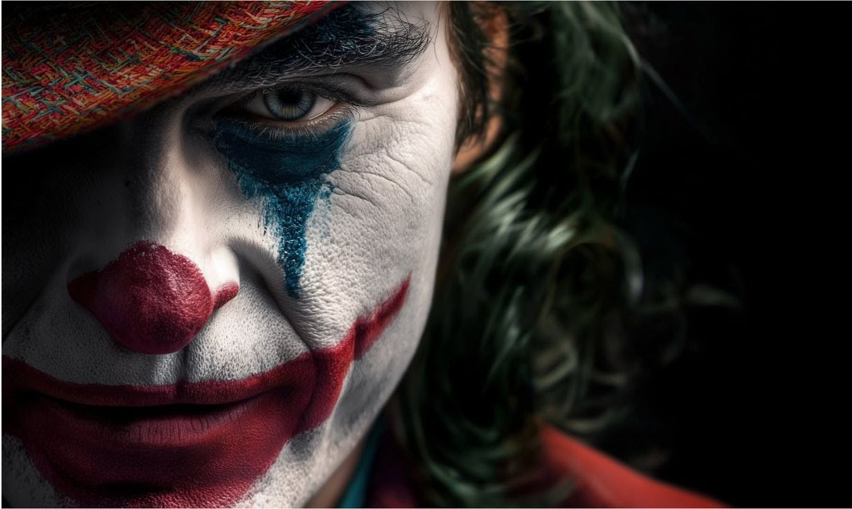
## Scene 1: The Clown Rebirth – Red, White & Blue Chaos
**Color Palette Overview:**
- **Highlights:** Pure whites (#FFFFFF) with warm peachy tones
- **Midtones:** Vibrant reds (#AC2E2E), bold blues (#305481), soft taupes
- **Shadows:** Dark teals, deep blues, almost black
**What's Happening Here:**
Remember that iconic moment when Arthur transforms in his apartment mirror? When he becomes the Joker? This scene is *visually designed* to assault your senses.
The color scheme uses **split-complementary harmony**—meaning the bright reds and blues are literally opposite on the color wheel, creating maximum visual tension. It's uncomfortable to look at. Intentionally. Arthur's world isn't beautiful anymore; it's sharp, it's contrasting, it's *disturbing*.
Notice the warm peachy highlights against the cool shadows? That's not an accident. It shows that even in his darkest moment, there's an almost theatrical, painful clarity. Like the lights in a stage production—harsh and revealing.
**What You Can Learn:**
- Use **opposite colors** when you want to create psychological discomfort
- Bright highlights create a sense of exposure and vulnerability
- Shadows that lean cool create isolation even in bright scenes
---
## Scene 2: Mental Isolation – Cool Institutional Greens & Blues
**Color Palette Overview:**
- **Highlights:** Pure whites (#FFFFFF), cool grays (#A2B9BD)
- **Midtones:** Institutional greens (#2A486A), muted teals, cool grays
- **Shadows:** Deep navy (#0A0F15), almost black, cool darks
**What's Happening Here:**
This is Arthur in the theater—an early scene where he's trying to escape his reality, trying to feel *something*. Notice how even in this "entertainment," the color grading is cold and uninviting?
The **dominant cool tones**—those institutional greens and teals—make you feel like you're watching someone in a clinical, sterile environment. There's no warmth, no comfort, no "escape." Even though he's at the movies trying to feel joy, the color grading tells us he's still trapped.
The highlights are almost clinical white—bright but harsh, not gentle. This is the visual equivalent of fluorescent lighting in a government office.
**What You Can Learn:**
- Cool color palettes create emotional distance and coldness
- Institutional greens/teals communicate confinement and despair
- Bright whites can feel clinical and unwelcoming, not comforting
- Color temperature (warm vs. cool) is everything for mood
---
## Scene 3: Urban Decay & City Reflection – Warm Shadows, Cool Lights
**Color Palette Overview:**
- **Highlights:** Peachy tones (#D3BFAB), soft whites (#D6C787)
- **Midtones:** Warm browns (#6F4E37, #8C6D5B), muted golds
- **Shadows:** Dark browns (#2B1D16), cool teals, deep grays
**What's Happening Here:**
Arthur in the apartment complex—notice how the colors are now *more alive* than before? There's warmth here, but it's a *dirty* warmth. Like streetlight hitting old brick.
This palette uses **analogous colors** (colors near each other on the color wheel)—the warm golds and browns working together create a sense of familiarity, but the dark shadows keep it gritty and real. There's no glamour here, just the honest grime of city living.
The contrast between the warm highlights and cool shadows creates **depth and atmosphere**—you feel like you're actually *in* these dingy corridors.
**What You Can Learn:**
- Warm color palettes aren't always "happy"—dirty warmth can feel exhausting
- Mixing warm and cool tones creates visual interest and emotional complexity
- Dark shadows that lean cool create three-dimensionality
- Real locations need grading that honors their texture while controlling mood
---
## Scene 4: The Dance on the Stairs – Primary Color Explosion
**Color Palette Overview:**
- **Highlights:** Pure whites (#FFFFFF), warm creams (#E1E1E1)
- **Midtones:** Bold reds (#AC2E2E), golden yellows (#D4A526), cool teals (#5D7975)
- **Shadows:** Deep teals (#1D2C31), dark grays (#3A3A3B), cool blacks
**What's Happening Here:**
THIS. SCENE.
If you haven't seen Joker, this is the moment where Arthur fully transforms. He's dancing on public stairs in full clown makeup, and cinematographer Lawrence Sher absolutely goes *in* with the color grading.
The **primary colors** (red, yellow, blue) are present but not balanced—they're in conflict. Red dominates the composition (his suit, the danger), but you've got those cool teals in the background creating what's called **split-complementary harmony** again.
Here's what's brilliant: The highlights are still relatively pure (whites and creams), which keeps some realism. But the introduction of that golden yellow in the midtones? That's pure theatrical energy. It's like stage lighting. It's not natural, and it *shouldn't* be. Arthur isn't in reality anymore; he's in his own performance.
**What You Can Learn:**
- Primary colors create maximum visual impact and energy
- Slightly desaturated teals against warm reds create psychologically unsettling tension
- Golden yellows can feel theatrical and artificial—perfect for showing disconnection from reality
- Mixing true colors with realism (realistic whites) keeps it from looking cartoonish while still pushing it further than natural
- The color grading here literally shows Arthur's descent into his performed persona
---
## Scene 5: Subway Madness – Green Sickness & Fluorescent Dread
**Color Palette Overview:**
- **Highlights:** Pale whites (#D6E8D8), cool creams (#F1F1F1)
- **Midtones:** Sickly greens (#B8922C), institutional teals (#496D56), worn golds
- **Shadows:** Dark greens (#25302E), cool darks (#4C3D2F), blacks
**What's Happening Here:**
The subway scene. Where Arthur *really* loses it. The entire color palette has shifted to **sickly, nauseous greens**—the kind of green you see in cheap fluorescent lighting in government buildings or old buses.
This is genius, because greens are supposed to be natural and calming, right? But this isn't that green. This green makes you feel *uncomfortable*. It's the opposite of healing—it's the visual equivalent of your stomach turning.
The limited warmth (those golden teals) doesn't feel like comfort; it feels like stained, aged material. The overall effect is **alienating**—even surrounded by people, Arthur feels sick and alone.
The color grading here tells us: *This world is making him sick. Literally.*
**What You Can Learn:**
- Greens can be twisted into feeling wrong and unsettling
- Fluorescent-style lighting palettes communicate institutional coldness
- Sickly color tones make viewers uncomfortable—sometimes that's exactly what you want
- Limited color palette (mostly mono-chromatic in the green family) creates claustrophobia
- Institutional settings need grading that feels authentic to their *real* unpleasantness
---
## Scene 6: Cold Isolation – Teal Prison
**Color Palette Overview:**
- **Highlights:** Cool whites (#A6B4B3), pale grays (#D4C9BF)
- **Midtones:** Cool institutional teals (#3B5F5F), warm taupes (#6C5248), muted browns
- **Shadows:** Deep teals (#1B2929), dark grays (#2D2726), almost-black shadows
**What's Happening Here:**
Another moment of Arthur alone, in what feels like an interrogation room or confined space. The color palette is **dominated by cool teals**—that institutional color we've seen before, but here it's even more pronounced.
There's still a *tiny* bit of warmth in the midtones (those taupes), just enough to keep it feeling like an *interior* space rather than pure cold, but not enough to feel welcoming.
The teal walls essentially become a character in the scene—they're not just setting the mood; they're expressing Arthur's mental state: *trapped, observed, alone, institutional*.
**What You Can Learn:**
- Institutional teals and greens communicate confinement across multiple scenes
- Minimal warmth in otherwise cool palettes creates a sense of dying hope
- Color consistency across scenes builds a visual language for character psychology
- Cool highlights don't have to feel bright—they can feel sterile and examining
---
## Scene 7: The Final Transformation – Clown Apotheosis
**Color Palette Overview:**
- **Highlights:** Pure whites (#F8F8F8), warm peachy tones (#E0D1C6)
- **Midtones:** Saturated reds (#BB4744), cool blues (#902528), muted browns
- **Shadows:** Very dark indigos (#1A1A1A), cool blacks (#2B2C2D), deep shadows (#413C3B)
**What's Happening Here:**
The final reveal. Arthur in full clown makeup, fully realized. The color palette has evolved one last time.
Notice the **saturated red**? This isn't the slightly muted red from earlier—this is *bold*, primary red. He's done hiding. He's done transforming. He *is* the Joker.
But here's what keeps it from being cartoon-ish: the shadows stay complex. There's still that cool blue-gray working behind the scenes, and the overall exposure is controlled. The whites aren't blown out; they're rich and painterly.
The interplay between the warm peachy highlights and the cool shadows creates a **portrait-like quality**—like we're looking at an oil painting, something timeless and carefully composed. Because Arthur isn't a guy having a breakdown anymore. He's become an *idea*. A performance. An icon.
**What You Can Learn:**
- Primary reds need context—pair them with cool shadows to keep realism
- Full saturation + careful control of highlights = powerful but not cartoonish
- The final transformation deserves the most intentional, composed color palette
- Warm and cool interplay creates dimensionality even in extreme color situations
- Color evolution tells character arc without dialogue
---
## The Bigger Picture: Overall Harmony & Palette Progression
Let's zoom out for a second. Across the entire film, the color palette follows Arthur's psychological journey:
**Early Film (Depressed Arthur):** Cool greens, institutional teals, sickly tones, cold isolation
↓
**Middle Film (Awakening):** Introduction of warm tones, theatrical lighting creeps in, reality starts to fracture
↓
**Late Film (Transformed):** Primary colors, bold reds and yellows, theatrical energy fully realized
↓
**End (Complete Transformation):** Saturated, controlled primary colors, almost painting-like quality
This progression is the **color narrative of the entire film**. If you removed the sound, the color grading alone tells you this story.
---
## Key Color Grading Principles You Need to Master
### 1. **Color as Character**
Colors aren't decoration—they're psychological tools. Cool tones = isolation, institutional coldness. Warm tones = human connection, but they can also feel dirty and exhausting. Primary colors = theatrical, unreal, energetic.
### 2. **Split-Complementary Harmony**
Opposite colors on the color wheel create tension and visual interest. Red against teal isn't natural, and *that's the point*. Use complementary colors when you want discomfort.
### 3. **Color Temperature Tells Story**
Cool shadows + warm highlights = emotional complexity. Pure cool or pure warm = extremes. Most reality is a mix, and grading should reflect that unless you're deliberately distorting reality.
### 4. **Highlights Are Sacred**
In Joker, the highlights stay relatively controlled and realistic (whites and peachy tones) even when midtones and shadows go wild. This keeps the image from feeling cartoonish. Protect your whites.
### 5. **Institutional Green/Teal = Confinement**
This is visual shorthand. Government buildings, hospitals, prisons—they all lean green or institutional teal. If you want that feeling, lean into it. It's been culturally coded into our brains.
### 6. **Shadows Create Depth**
Dark shadows that lean toward opposite colors create three-dimensionality. If your midtones are warm, cool shadows make them pop. And shadows can be almost any color—don't just make them black.
### 7. **Palette Progression = Character Arc**
Plan your color story before you shoot. What colors represent your character at different points? How does that shift? Color should evolve with the narrative.
---
## Practical Application: How to Use This for Your Own Work
**Step 1: Identify Your Story's Emotional Arc**
Before you grade a single frame, ask: "What's my character feeling? What do I want the audience to *feel* when they watch this?"
**Step 2: Create a Color Narrative**
Sketch out your color story. Maybe it goes from cool → warm → vibrant. Maybe it stays cool to emphasize alienation. Maybe it's all chaos. Plan it.
**Step 3: Build Your LUT or Grading Curve**
In DaVinci Resolve (or your software of choice), start with shadow/midtone/highlight adjustments that support your story. Don't just push saturation randomly.
**Step 4: Watch for Realism Anchors**
Even in Joker's wild color choices, the whites stay relatively pure, and natural skin tones stay somewhat believable. That's your realism anchor. Don't lose it unless you're *deliberately* going surreal.
**Step 5: Check Your Color Harmony**
Use the color wheel. Are you complementary? Analogous? Triadic? Whatever you choose, be intentional. Don't let colors happen by accident.
**Step 6: Remember—Less Is Often More**
The most powerful scenes in Joker aren't the most colorful. Sometimes it's about what you *don't* saturate that makes what you do saturate powerful.
---
## Common Color Grading Mistakes (And How Joker Avoids Them)
### ❌ **Mistake 1: Saturating Everything Equally**
Your entire image shouldn't be equally saturated. Joker isolates color—reds in the suit, teals in the background, whites in the highlights. That contrast is what makes the saturation work.
### ❌ **Mistake 2: Forgetting Your Shadows**
Amateurs leave shadows flat and black. Joker uses shadow detail and color *constantly*. Your shadows should have information and color variation.
### ❌ **Mistake 3: Not Planning Your Color Arc**
If you're grading day-by-day without a plan, your colors will feel scattered. Joker's colors are deliberately chosen to reflect a progression. Plan yours.
### ❌ **Mistake 4: Pushing Skin Tones Unnaturally**
Even in the wildest color grading scenes, skin tones stay relatively believable. Don't sacrifice believability unless you're going full surreal.
### ❌ **Mistake 5: Using Institutional Green Without Intention**
That institutional teal/green appears specifically to communicate coldness and confinement. Don't use it randomly. Colors should mean something.
---
## Final Thoughts: Color Grading Is Storytelling
Here's what blew my mind when analyzing Joker: **the color grading is doing half the emotional work of the performance**. Joaquin Phoenix is brilliant, but he's standing in a world that's been deliberately colored to match his mental state.
Color grading isn't just "making it look good." It's not even just "matching the mood." It's *character development in wavelengths*.
When you're learning color grading, don't just learn the technical tools. Learn to see what the colors are *saying*. Learn to use them intentionally. Learn to plan them before you hit record.
That's what separates people who color-correct footage from people who *color-grade stories*.
---
## Resources to Deepen Your Learning
- **Study Film:** Rewatch Joker with a color notebook. Pause scenes. Write down what you see.
- **Practice:** Take footage from your phone and try to match the color narratives you see in your favorite films.
- **Software:** Get comfortable in DaVinci Resolve, Premiere Pro, or Final Cut Pro's color panels.
- **Color Theory:** Understand the color wheel, complementary colors, analogous colors, and triadic harmonies.
- **Look at Reference:** Save screenshots of color palettes that inspire you. Build your own library.
---
## About Freelance Filmmakers Academy
At **Freelance Filmmakers Academy**, we believe that learning filmmaking isn't about memorizing rules—it's about understanding the *why* behind the choices great filmmakers make. Our color grading courses break down real-world examples like Joker to show you not just *how* to grade, but *why* you grade.
Whether you're in Kerala or anywhere else, we're here to help you become the colorist (and filmmaker) you want to be.
**Enroll today and start mastering color grading with real film examples.**
---
## Questions? Let's Chat!
Have you noticed the color grading in other films? What colors tell stories to you? Drop your thoughts in the comments, and let's talk about how color shapes cinema.
---
**Keywords:** Color grading, cinematography, Joker analysis, film analysis, color theory, DaVinci Resolve, color grading tutorial, best colour grading academy Kerala, color psychology, film production
**Last Updated:** 2025
**Reading Time:** 8-10 minutes